


The grammar of graphics
The art of communicating with graphics

Data science is a growing field that regroups talented and passionate people who generally show remarkable technical skills and outstanding ease to solve problems. However, from my personnal experience, one particular skill is often undervalued: Communication. In data science, as in many other fields, graphical vizualisation is an important tool that helps to simplify and clearly communicate results to others. For that reason, it’s crucial to master this set of skills. Just like any other means of communcation, like speaking or writing, graphical vizualisation basically requires two main components:
- A synthax/grammar/set of rules that ensures everything is well organized and broadly correct.
- A feeling/intuition to communicate the right things and present them in a way that will make people feel what you want them to feel.
We’ll briefly get into those two elements and I hope this short blog post will help you recognize the worth of having a good understanding of how to present and communicate your results.
The grammar of graphics
Have you ever worked with someone making lot of synthax or grammatical mistakes? Pretty sure you do… From my perspective, those people are generally tough to follow and poor at explaning their point of view. That’s because communicating through speaking or writing requires us to follow different rules. In some way, graphical representations also require us to follow certain rules. The grammar of graphics, a plotting framework developped by Leland Wilkinson in the 90s, constitutes an example of building blocks onto which grammatical rules have been developped to create “solid, creative and meaningful vizualisations”1.
The following sections are going to explain the main components of this particular grammar. We’ll go through the different layers (see figure below) of the grammar by illustrating it with a concrete example using ggplot2, a graphical library developped by Hadley Wickham and which is basically an implementation of this grammar of graphics in R.
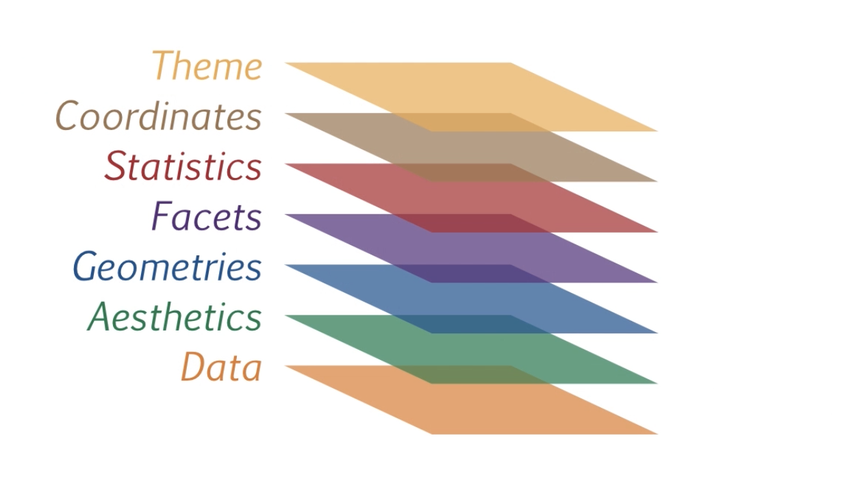
The different layers that constitutes the grammar of graphics framework
Essential grammatical elements
In its simple form, any well-constructed sentence requires at least mininal elements (generally a subject and a verb). In the same way, a graphic requires some essential grammatical elements:
- Data
- Aesthetics
- Geometries
Data
The data component is nothing but the dataset behind the graph. Without it, there is nothing to be plotted or vizualised. In order to properly use the ggplot2 framework and the grammar of graphics, the data structure is quite important. The data structure often related to this matter refers to the tidy format. For our example, we’ll use the mtcars dataset, from the dataset library. This particular dataset is already in a tidy (one-observation-one-row) structure as we can see below.
library(ggplot2)
library(tidyverse)
head(mtcars)
##                    mpg cyl disp  hp drat    wt  qsec vs am gear carb
## Mazda RX4         21.0   6  160 110 3.90 2.620 16.46  0  1    4    4
## Mazda RX4 Wag     21.0   6  160 110 3.90 2.875 17.02  0  1    4    4
## Datsun 710        22.8   4  108  93 3.85 2.320 18.61  1  1    4    1
## Hornet 4 Drive    21.4   6  258 110 3.08 3.215 19.44  1  0    3    1
## Hornet Sportabout 18.7   8  360 175 3.15 3.440 17.02  0  0    3    2
## Valiant           18.1   6  225 105 2.76 3.460 20.22  1  0    3    1
Aesthetics
We can see our data layer as a bank of words we could use to build our sentence. Once we have our available words, obviously, we need to pick up few of them and organize them in order to build a sentence. Aesthetics is somewhat similar to the action of “pick and organize”” as it defines the scales onto which the data selected is mapped. For example, we could decide to select horsepower and miles per gallon variables from our dataset and plot them onto x and y axis respectively (see figure below).
ggplot(mtcars, aes(x = hp, y = mpg)) +
  geom_point()
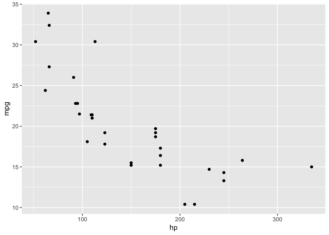
Aesthetics (hp and mpg) define which scales are plotted.
In the ggplot2 framework, we define our aesthetics in the aes() argument.
Geometries
In the previous section, we use points through a scatter plot to vizualise our data. The use of points, or other visual elements known as geometries (lines, bars, text, etc) control the type of plot you wanna create. As a comparison, it can be seen as the type of sentence (declarative, imperative, interrogative, etc) you wanna build. It does not define your content, but rather the way you express your content. For example, instead of points, we could have shown bars (see figure below).
mtcars %>%
  group_by(cyl) %>%
  summarise(hp_mean = mean(hp)) %>%
    ggplot(aes(x = cyl, y = hp_mean)) +
      geom_bar(stat = "identity")
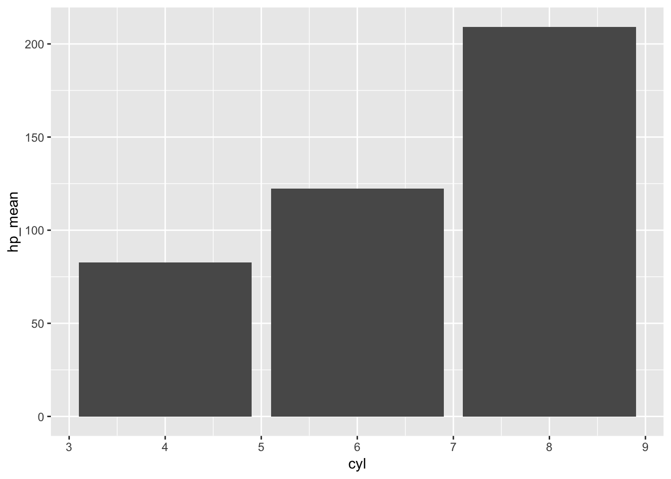
Geometries (bars here) define mainly the type of plot
In the ggplot2 framework, we add geometries with geom_xxxx to our plot.
Optional grammatical elements
In the real world, we usually don’t communicate with the simplest kind of sentences. In order to be more precise or more convincing, we usually add adverbs or adjectives around the essential grammatical elements. In the same way, we usually clarify our graphical vizualisations by adding some optional grammatical elements:
- Facets
- Statistics
- Coordinates
- Themes
Facets
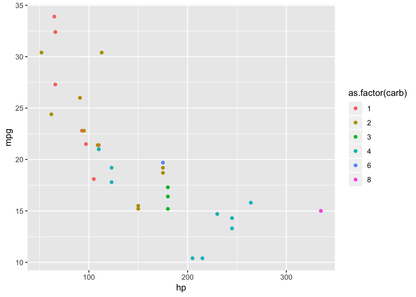
Facetting a graphic means to plot small different subsets of the data. Relating to grammar, I would compare the action of facetting with the idea of breaking a long sentence in some shorter (clearer) sentences. It’s a powerful tool when looking for some patterns in the data as it could help removing the noise of different groups plotted all togheter.
For example, it’s difficult to see the true pattern of each group in the following graphic:
ggplot(mtcars, aes(x = hp, y = mpg, color = as.factor(carb))) +
  geom_point()
It’s quite clearer in the figure below.
ggplot(mtcars, aes(x = hp, y = mpg, color = as.factor(carb))) +
  geom_point() +
  facet_grid(. ~ as.factor(carb))
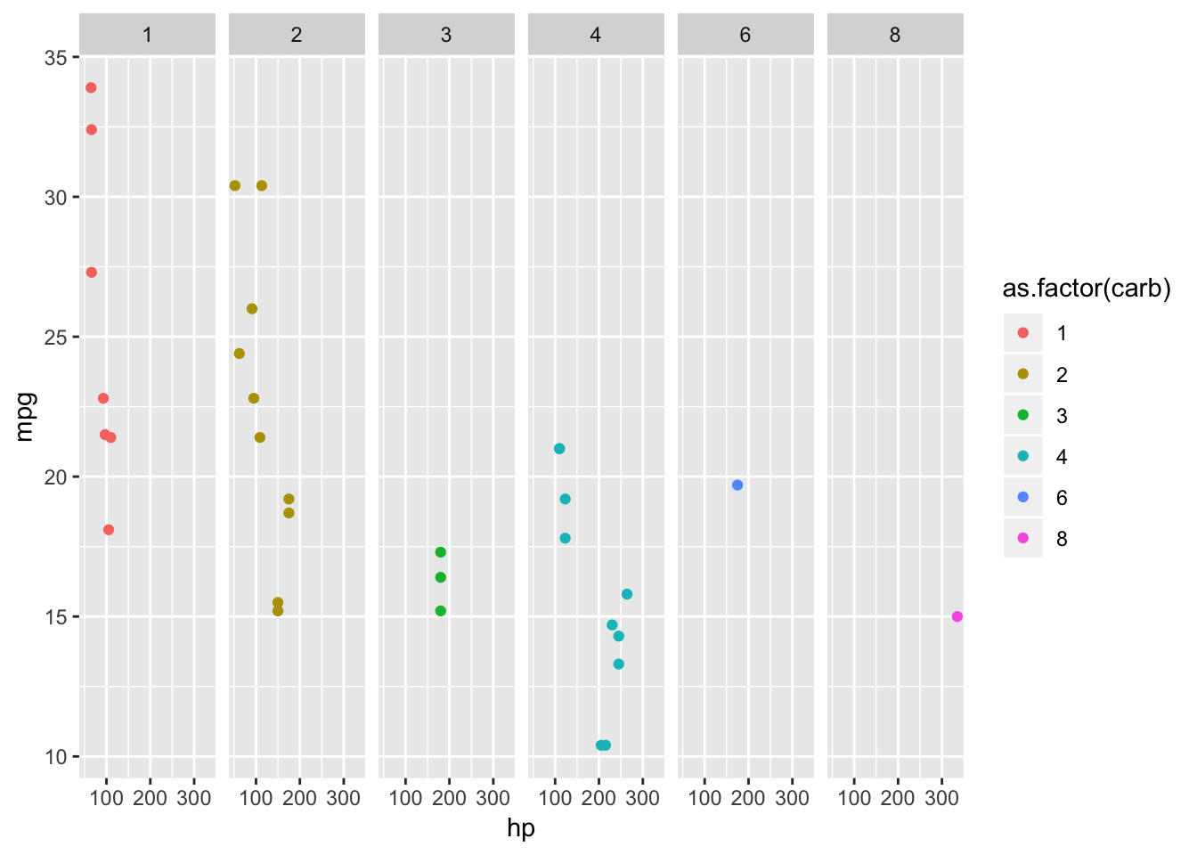
Facetted plot are way more easier to detect a pattern in each group
The facet_grid() or facet_wrap() specifications describe which variables are splitted and how they should be arranged in the plot.
Statistics
Statistics is a layer that summarizes the data in order to aid our understanding. To illustrate it, we could compare the objective of this layer with the idea of summarizing a long and complicated paragraph into essential bullet points. For example, boxplots could be seen as a statistic as it calculates essential statistics of a given distribution.
In our example, it’s far more difficult to draw conclusions about the distributions of each number of cylinders from the figure
ggplot(mtcars, aes(x = as.factor(cyl), y = mpg)) +
  geom_point()
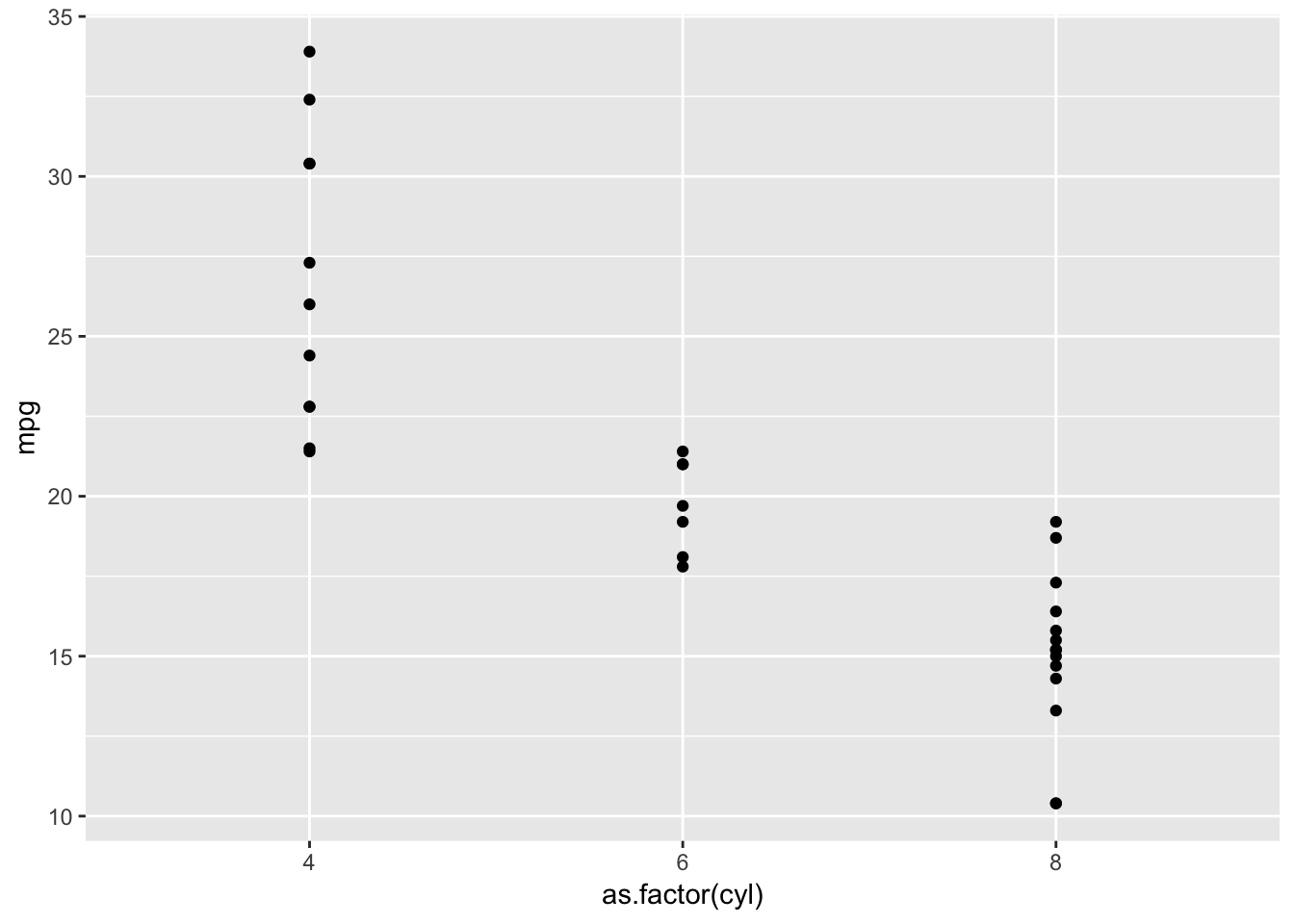
It's difficult to conclude something from non-summarized data
compared to the figure below, where we can easily extract the median, the quartiles and so on…
ggplot(mtcars, aes(x = as.factor(cyl), y = mpg)) +
  geom_boxplot()
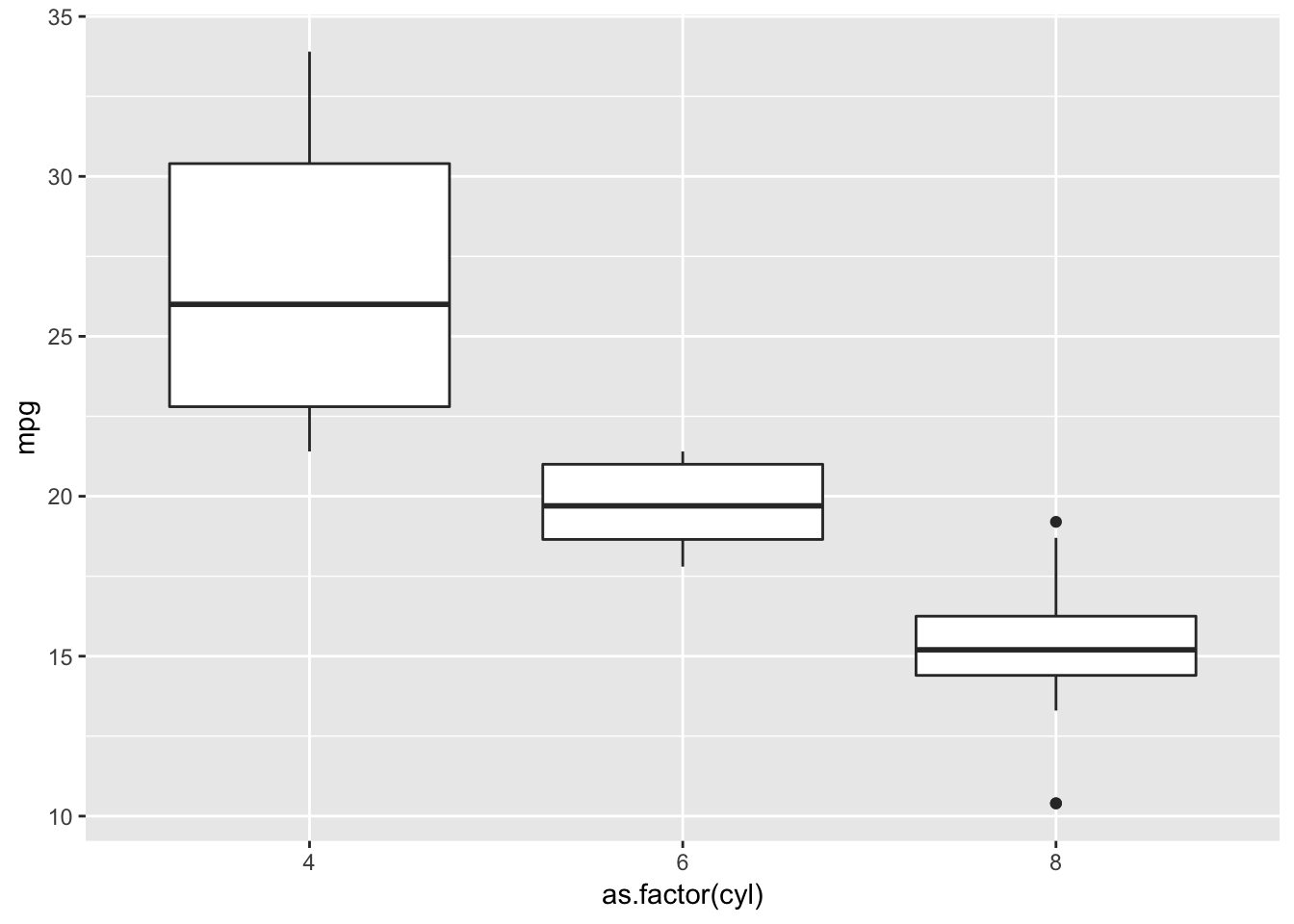
Boxplots kind of summarize the data and make the plot easier to understand our data
Coordinates
Coordinates define the space in which we plot our data. Usually, the Cartesian coordinate system is used but we could also plot our data using a polar or semi-log coordinate system depending on the context.
Themes
Themes can be seen as evertything non-related to the data. In the grammar of graphics framework, themes ease the understanding of our plots, not necessarily making them more beautiful. In fact, the font type and size, the spacing, the margins, and so on, help to make a text more understandable for the reader. In the same way, the size of geoms, the grid lines or the background color should be carefully chosen in order to direct the audience’s focus on the message we want to express with our plot. For example, the non-related data elements in the figure make it difficult to see relevant patterns in the trend shown by the data:
ggplot(mtcars, aes(x = mpg, y = qsec)) +
  geom_point(color = "yellow", size  = 2) +
  geom_smooth(color = "red") +
  labs(title = "Qsec vs mpg") +
  theme_dark() +
  theme(title = element_text(family = "Luminari", face = "bold.italic", colour = "red"),
        plot.background = element_rect(fill = "yellow"))
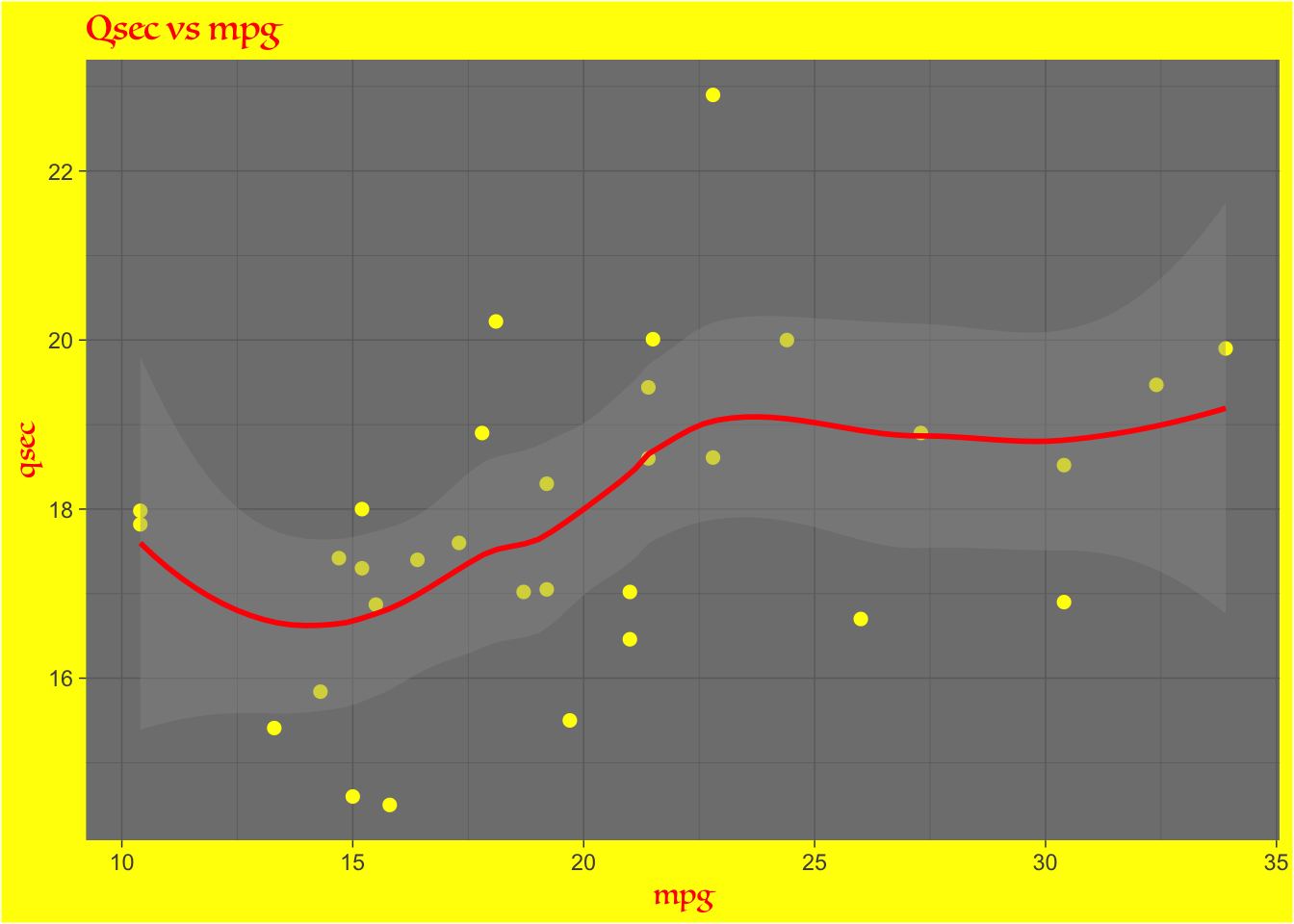
Overuse of themes causes our mind to focus on non-related data elements
In contrast, the next figure is way clearer as nothing irrelevant has been added to the plot. This leads the reader to focus on the data and the trend behind it:
ggplot(mtcars, aes(x = mpg, y = qsec)) +
  geom_point() +
  geom_smooth() +
  labs(title = "Qsec vs mpg") +
  theme_classic()
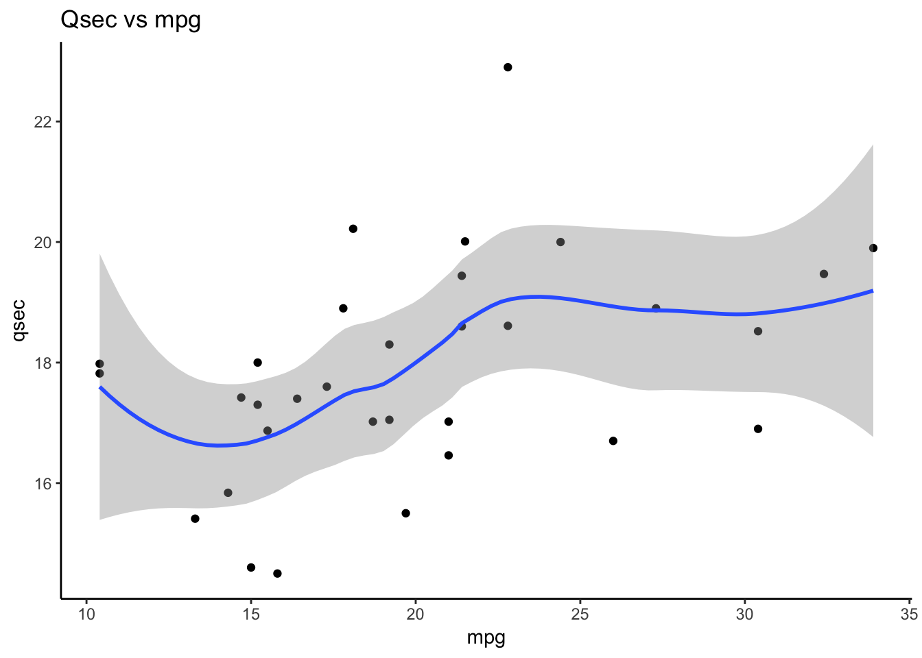
Clear and simple themes aid to understand the data related elements, which contribute to make our plot more meaningful
In ggplot2 framework, some themes are prebuilt and can be used directly. However, everything can be customized in the theme() layer. The ggthemes library also has some nice available themes.
Intuition for good graphics
As mentionned in the introduction, a good and structured communication requires to follow certain rules (which were described in the first part), but also requires a kind of feeling to identify the things that need to be communicated and to make good choices about how to communicate them.
“Good grammar is just the first step in creating a good sentence.”2
This part is probably the toughest to learn and certainly needs a lot of practice and experience to master. However, some elements can help us build meaningful graphics:
Our objective
This is probably the most important thing to keep in mind while developping a graphical visualization. It should always guide our decisions (type of graphic, theme, aesthetics, etc.) because at the end, the graphic should help people understand something specific.
Data
The data is one of the first thing to take into account before working on a graphic. The type of data, the size of the data and so on should by itself indicate what is doable and what is not or what transformations should be done.
Our audience
The audience is always an important aspect of every communication. It should be taken into account and should also guide our decisions regarding our graphic. For example, boxplots can be quite meaningful for a given audience such as data scientists or statisticians but mean nothing to someone else.
The example 1 figure is an example of graphic that basically meets all the requirements explained in the grammar of graphics part. However, if our objective is to compare the miles per gallon consommation of different car models within each cylinder category, this graph may not be the best one. In fact, the focus is more on the value of miles per gallon for each model rather than on the relation between different models. In contrast, the example 2 figure’s focus seems to be more on the model names and their distances from each other rather than on the value of gas consumption. Also, the models are probably easier to vizualise wihtin their cylinder category groups by the usage of facets.
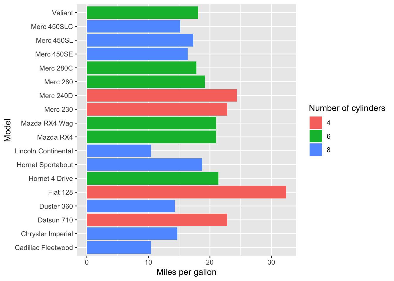
Example 1
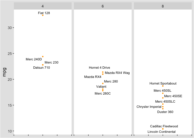
Example 2
The last example shows that there exists multiple ways to build a given graphical representation. However, all those representations can be “sorted” by relevance in a given situation. That being said, I think that for each context, depending on different elements such as the objective, the data and the audience, there exists a particular representation that is the most appropriate for that particular situation. Then, there are multiple representations that are still good, which means that the objective is then to practice and gain experience to ultimately approach the most suited one.
Conclusion
To conclude, it isn’t a coincidence if I started with the grammatical part and then finished with the “feeling” part. A good grammar is the base of every communication, it allows you to clearly communicate something and encourages people to focus on your content rather than on the way you express it. Once you master the rules behind the grammar, you have the freedom to express it the way you want and let your creativity speak for itself. In brief, we must start by learning a set of rules that will ultimatly allow us to communicate with convincing and, most importantly, creative graphics.
The complete code of this article can be found through this link.
Sources: